It’s been a few months since I wrote a blog about our critiques, so in good old fashion New Year resolution making, I rededicated myself to this effort. We are going on 4 years of this critique and it has been an exciting fellowship of Artist. I’m look forward to us continuing on and developing our vision and increasing our body of work.

We start with Ron Howlett’s two watercolor studies. These are finished works of art but I call them studies because Ron mentioned that these works are more like sketches made to develop a new series of artwork. If you follow the old blogs you can see that Ron is further developing this motif. Before there was the chasm between his rock formations under a very dramatic sky, where the ocean acted like a silent conduit between the two. Now the ocean has become alive and begins to be a major part of the dialog between rocks and sky. The first watercolor “Sea Night Fall” has five rocks in the foreground within the ocean which is actionable with whitecaps and rolling waves, all contrasted with a bright sky accompanied by a storm brewing on the left. There was little to constructively critique except with the five rock formation’s intersection between ocean and rock seems lost due to the dark shadowing; they begin to flatten out and lose some volume.

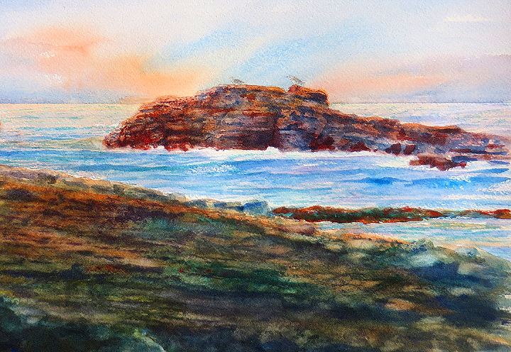
In the other watercolor “Oregon Coast” the ocean is loud with intent and rises up to make itself know to the large rock in the foreground. It reminded us all of Winslow Homers dramatic ocean scenes which a lot of Watercolorist strive hard to achieve; Ron has done this beautifully. There is a power that is greater than the whole in the artwork. The combination of the powerful ocean waves and the bold strong rocks heighten the drama of nature. The only little critique we had was creating a bit more texture in the shadow areas of the rocks, particularly the far left rock, but that is a minor issue to the greater success of creating the feeling of movement, flow of mist and the time worn battle between the rocks and the pounding ocean.

Thom’s work “Attitundal” revisits work from years past. The figure harkens back to a time when West Coast Artist were not willing to get rid of the figure for the sake of a fully abstracted piece. They wanted to use the East Coast aesthetic of bold mark-making, but juxtapose that against saturated colors and high value shifts within a known environment or motif, like figure, still lifes or landscapes. I suppose that is precisely the problem we saw in the piece. There is very little contrast in the work and in the areas that that happens there are element that mute that impact. For instance, the yellow around the figure’s head, the bright green against the figures highlighted left thigh and the value in the window which matches the interior. We suggested exploring the window more abstractly and contrasting the interior with the exterior through value. This is not unprecedented, there is a long history in art where exterior and interiors are contrasted and become a major part of the motif. On the other hand, we really like the mark-making that Thom had started and his always unique approach to balancing compositions with line and interesting shapes. We look forward to see how he resolves the piece.

I ‘finally’ finish my last Shipley Center painting. Last year I had a few distraction so it took some time to finish this piece (I’m still attempting to relieve myself from these distractions). In fact, it was the only major piece I did all year! In any case, it was well received and by showing it each critique it gave the group a chance to see my process (or madness) when it comes to building up layers of paint and abstracting from what I had previously learned by going out and doing a plein air painting of the same scene (in this case 6 times during the year) and then putting into practice what I had learned. As a side note, I’m starting a new series of plein air paintings at the Shipley Nature Center and I found a new spot there. Now I need to dedicate myself to getting out there each month. In any case, I like the finished piece which is called “Sage Mound”.
I hope you enjoyed the blog, and we look forward to reading your comments, and a perhaps joining us in 2015.
Very nice critique, and nice work. I see you guys are still doing your usual thing! Great stuff! I’ve gone to a couple of art festivals out here. They seem to consist of mostly utilitarian stuff – jewelry, ceramics, etc. I’ve seem some nice stuff though. I hope to make this year a productive one and find another art critique group.